Review: Winnebago Graveyard #4
Lifetime reader of comics and fan of Planet of the Apes. When the two combine I can barely contain myself. Image, Boom and Titan comics fight for shelf space with Doctor Who DVDs.
All good things must come to an end and our contributor, Darryll Robson, takes a look at the final issue of Winnebago Graveyard from Image Comics.
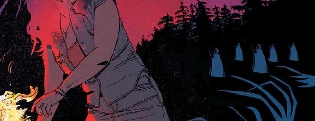
Winnebago Graveyard has been building up over the first three issues, introducing the characters, settings and the gruesome possibilities of demonic creatures. And this final issue is the big pay-off. Fans of the horror genre should not be taken by surprise by the way this issue plays out; this is where it all hits the fan.
Warning: some spoilers ahead. And blood. And guts. And unashamed horror.
You have been warned.
Synopsis
After Dan’s shocking fate last month, Christie has reached the edge and she is not about to let anyone, or anything, push her any further.
Together with her son and new young friend Deacon, they hatch a plan to fight back. Using the resources at their disposal, demon skin and abandoned camper vans, they make a stand against the town.
It’s not all smooth sailing and there are casualties along the way but a cleansing fire promises to sweep the Winnebago Graveyard clean.
Analysis
This is the end; a climax with mass destruction. And a satisfying one at that. It is almost a trope in the horror genre that the ending turns out to be disappointing, especially if the ‘creature’ reveal is underwhelming. But not here, not with Steve Niles and Alison Sampson in charge.
The issue starts off by reminding the reader what happened at the end of last month’s issue; it is a moment of peace for Christie to mourn her partners’ death and the only calm moment that the characters, and the readers, will have until the end. From here on it is tension and violence.
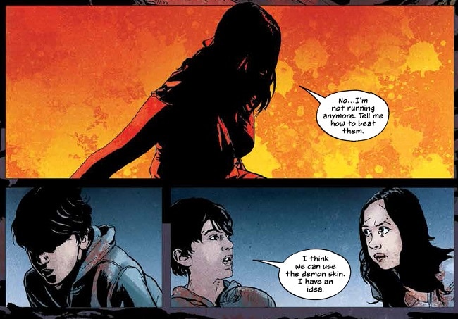
The second panel of the comic is a frontal assault on the reader’s eyes, visually burning away Christie’s previous fears as she states “I’m not running anymore.” She is making a stand and the simple silhouette on an orange and yellow background is a stark contract to the grey/blues of the night panels that surround it. It marks a turning point for the character and the narrative. It stands out to emphasis this point. But it is also a precursor to what is to come, a prophesying panel if you will. The color change represents the purifying fire that Christie and her two cohorts are about to set burning in the town.
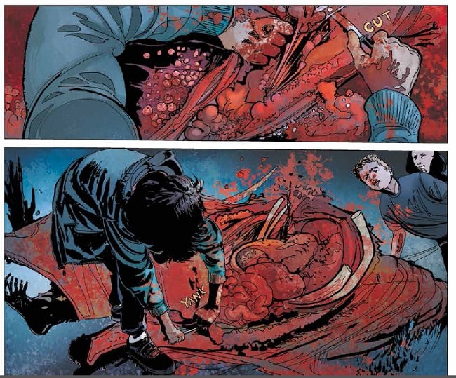
The next few pages also seem to be reflective of future events. Deacon has formulated a plan which involves skinning the demon killed by Dan in the previous issue. The two pages where this occurs are grotesque and soaked in the dark crimson of blood. Deacon himself becomes covered head to toe, a foreshadowing of his ultimate fate? You’ll have to read to find out.
From this point on Steve Niles leads the reader into the town and lets the violence unfold. It is a revenge fuelled tour de force. As the fires burn and the blood starts to flow, Niles shows the reader how lost in the moment the three central characters are; they revel in the madness as if they too are lost. But there is a moment when they are pulled back down to Earth and the horror of the situation once more rules their lives. This is an important moment in the comic because it reminds the reader, as well as Christie, that people have died and are continuing to die. The adrenaline has been pumping and the destruction has been entertaining but it all has a very high price. Niles reminds us of this in two different scenes. The first time when someone dies (Who dies? I can’t tell you) and the second time when the survivors of the cast pass by refuges from the town. The human cost is brought home and the final two panels of the series displays many levels of horror; emotional and physical. As with all good stories in the genre, the central characters have grown up and become scarred by what they have seen.
This issue is about darkness and light; the conflict between the two. This is best represented by Alison Sampson’s art work and Stephane Paitreau’s amazing color work. I have already spoke about the importance of the second panel of the comic, but the contrasting color landscapes don’t end there. The rage of the characters’ revenge slowly engulfs the town as the blue color palette is replaced by burning yellows and red hues. The fire appears to radiate from Christie and Bobby as they spread it around; in some sequences the color chases them across the landscapes, creeping over rocks in a bid to catch them. It’s not until the final page that any normality of the color returns, heralding safety.
Steve Niles knows when to use speech and when to keep the panels silent. This allows the art work to create a twilight hour which is both endless and immediate. Everything in this issue happens in one short night but the eerie calm across the town has an eternal feel to it. This is one of the greatest horror tropes; so much happens in the space of one night and when the dawn comes, all will be well. It can last as long as it needs to without the constraints of a ticking clock. The silence adds a layer of tension to the proceedings, especially when you would expect there to be a lot of noise, sound effects etc. Exploding caravan’s and burning cult members suffer in silence and it’s telling that the only time sound effects are added are when panels also include one of the central cast. It’s as if what happens to anyone or anything else is less important, less real.
One of my favourite panels in this issue, after the first page, features a cult member throwing a pitchfork. Sampson has isolated him in the panel from everything else by removing the background completely, it’s not even a color blur; it’s gone. This is to focus the reader entirely on the man and the pitchfork, more so the hurtling weapon, as it is coming directly for us, the reader. Sampson has positioned us in the line of danger and drawn the character out of the setting. This epitomises every over the top action in every 3D horror movie made. It is about making the reader a part of the story and not just a distanced bystander. We are glad that the pitchfork misses us but then experience a heightened guilt when we turn the page and see where the pitchfork ends up. That sigh of relief turns into a gasp of horror.
Winnebago Graveyard has been an impressive work of sequential art from start to finish. Some people might not see passed the horror tropes that litter the narrative but they are used in a number of ways; they produce a feeling of nostalgia; they are used to set scene and mislead the reader; they are occasionally used to produce a moment of comedy. But most importantly, in the hands of genre creators like Niles, Sampson and Paitreau, they are used because they work so well. The scripting across the board has been measured and steadily paced leading to a crescendo of equal delight and disturbance. The art work has challenged the confines of the traditional comic book format and used the genre to twist the way that the images work on the page. This isn’t realism but draws on a heightened sense of gothic beauty that can be traced through the horror genre back to Frankenstein, Dracula, and beyond.
Any fan of the horror genre should pick this up.
Darryll Robson is a Contributor to ComiConverse. Occasionally he remembers his Twitter account: @DarryllRobson