Review: 30 Days of Night #4
Lifetime reader of comics and fan of Planet of the Apes. When the two combine I can barely contain myself. Image, Boom and Titan comics fight for shelf space with Doctor Who DVDs.
IDW’s horror comic 30 Days of Night reaches its 4th issue this week. Our contributor, Darryll Robson, takes a look into the darkened world of Barrow to see how the story is unfolding.
Violence and horror are the name of the game in Steve Niles continued re-imaging of the 30 Days of Night franchise. Stepping up the pace and laying on the gore, Niles takes the narrative to the next level as the vampires finally arrive in town. With a limited cast and an army of vampires, can Niles and co keep the story fresh or will it become clichéd and old hat?
Synopsis
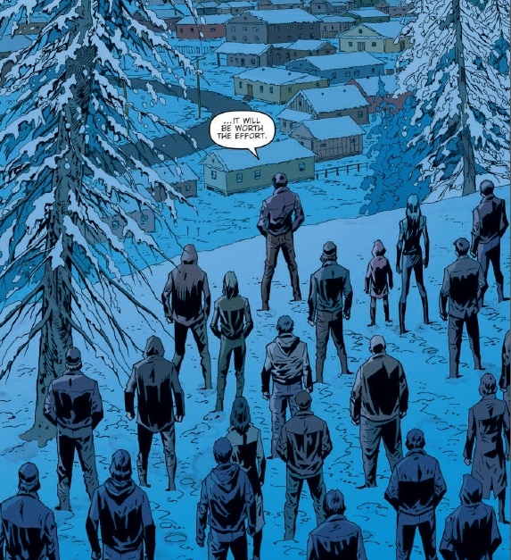
Darkness has descended on the town of Barrow. The power is out throughout the town, there’s no way out except by foot, across the plains of snow. And unbeknownst to the inhabitants, a collective of vampires is making its way out of the wilderness.
The local Sheriff, Stella, believes she has taken care of everything and can now mourn her husband. Unfortunately, the blood suckers are now on the streets and when the Sheriff and her deputy find the first victims they get more than they bargained for.
The violent siege is just beginning.
Analysis
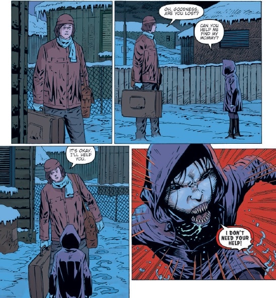
March appears to be the month when the action comes to comics. Last week saw Kong on the Planet of the Apes step up its violence quota and East of West had a city wide massacre. Following suit, issue 4 of 30 Days of Night revels in the gore that follows in the wake of the vampire’s journey into town. The narrative is simply one violent assault after another; finding violent ways to introduce the vampire characters to the town folks the previous issues have focused on.
Steve Niles has kept the cast relatively small so that he can focus on their plight without having to fill each issue with a sprawling town of people. This means that the emotional impact and horror of the situation can be controlled and honed. The Sheriff is the central character and everything that happens in the narrative in some way relates to her: it may not instantly be recognisable as such but ultimately it comes back to her. Niles has written the story so that the reader has a vested interest in Stella; the audience is routing for her. As such everything leads back to her and the threats to her are more heart felt, more nerve-wracking.
This issue is the epitome of that concept. Although it may seem like a random series of violent attacks, Niles actually cleverly plots the sequence of events to enhance the threat levels to Stella and her deputy. The first attack sets precedence for the violence. It is disarming and brutal. The reader knows it is coming which creates the tension in the leading panels and then isn’t spared the goriness of the attack. The second attack sequence imparts information about the vampire’s resistance to fire arms. Both of these things are fore front in the reader’s mind when Stella first confronts a vampire for the first time and this third attack sequence is loaded with horrors that have already been shown. The risk is greater, the tension higher because the reader know what can, and probably will, happen.
The structuring of this comic is wonderful: the way that Niles makes a blood orgy something more than violence for violence sake and instead works for the greater narrative. It is clever plotting and precision execution.
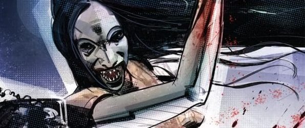
Of course all of this would be wasted if not for Piotr Kowalski’s art work and Brad Simpson’s amazing colours. Kowalski uses thin inked lines to define character and then blocks of shadow to distort or emphasise a particular panel. The vampire reveal is a prime example of where this technique is used. Kowalski uses heavy black shadows to hide features and then to distort the faces of the blood sucking creatures. In contrast the human counterparts have minimal feature lines and flat areas of colour. This helps to differentiate between the two sets of characters but also works on a deeper, subconscious level; the light and the dark represents the good and evil inherent in the characteristics and actions.
As per previous months, one of the highlights of this comic is Simpson’s colouring. The stark contrast between the blue and the red in the scenes is almost too simple but the implementation is perfect. The majority of this comic is a wash of cold blue and greys with some of the characters having a colour scheme of their own such as Martha and Rich who have a subdued red, almost brown, colouring. In contrast to this cold, barren feel, the scenes of violence are drenched in heavy blood red panels filling the background or taking over the panel entirely. The gore takes over the panel, flooding it with the horror of the moment. These panels leap out of the page naturally drawing the eye to them. This makes the placement of these panels on a page especially important.
30 Days of Night #4 might seem familiar, that’s one of the drawbacks of re-imaging narratives, especially after a limited time. But the beauty of this comic is not the actual story per se but the way that it is told. The structure of the narrative; the simple contrasts in the art work; and of course the colouring style which calls back to the original series; the creative craft of this comic is impressive on every level.
Darryll Robson is a Contributor to ComiConverse. Occasionally he remembers his Twitter account: @DarryllRobson, but he does remember to write more about comics on his website comiccutdown.com